
Thoughts on the Cover for “Too Like the Lightning”
 At long last, my forthcoming novel Too Like the Lightning has a cover! You can see it, and the first teaser description of the book, on Tor.com. So I thought I would share a few author’s thoughts on what it feels like to have a cover.
It’s an amazing, numinous feeling seeing the world I created materialize into a visual, quasi-real in such a different way. Of course, authors generally have no control over the cover art, which is something I have known for a long time, so I spent years preparing myself for a terrible cover. I even picked out the scene from the book which I thought would make the worst possible cover, making it look pulpy and the wrong genre, so that, if I imagined that cover, anything would be better. At one point my wonderful housemates even made a terrible CG mockup of the terrible cover, which I still treasure as a mouse pad, my long preparation bracing myself for the worst. (I will not post that image since it’s a spoiler, but it’s so bad!) It has made me smile and wince for many years.
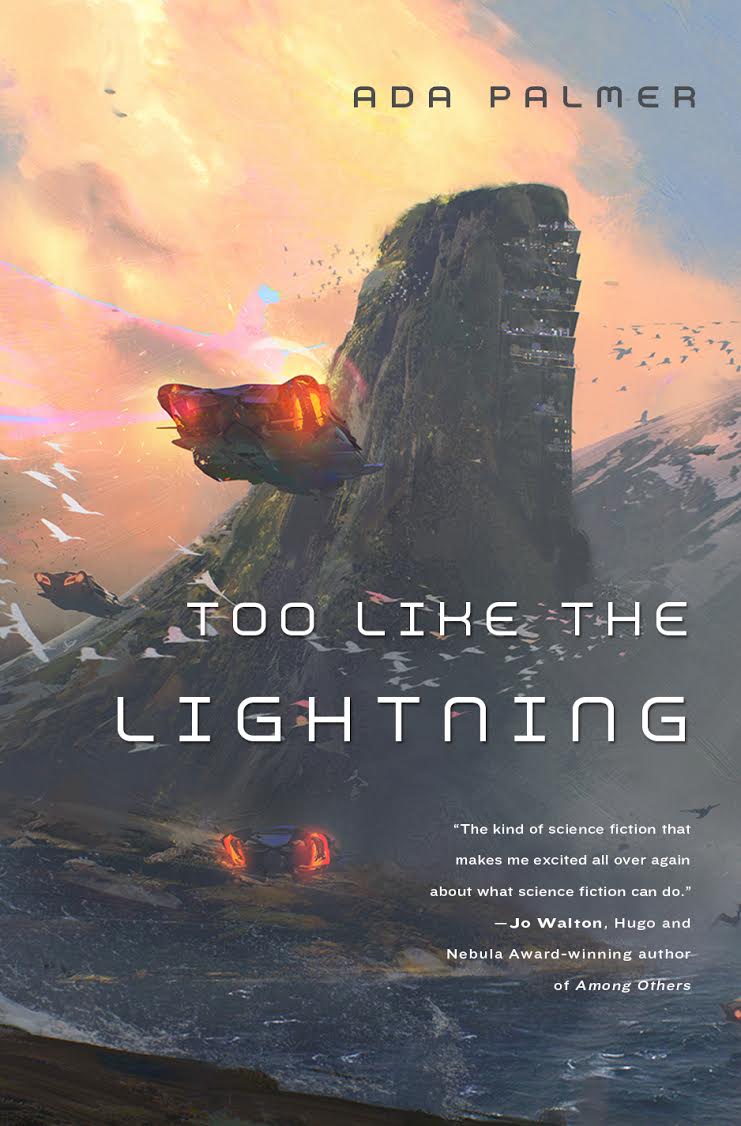
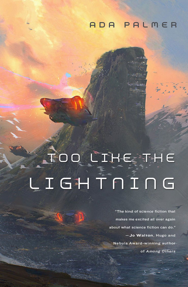
The real one, executed by Victor Mosquera, is wonderful.
When my editor said he thought the covers for the Terra Ignota series should be cityscapes, a different city on each of the four books, I was overjoyed. It was perfect. (And not only because if there are no characters pictured on the cover so they can’t look wrong.) Just as this blog is called “Ex Urbe” (From the City) because so much of what I look at is the culture and complexity of cities, and the identities, histories, peoples and events they shape, so this novel series focuses a lot on cities, especially the different global capitals which reflect the cultural and political developments which are the heart of this science-fictional world.
The Terra Ignota books take place in 2454, so some of its cities are present day capitals which I extrapolate forward, asking what Paris or Alexandria will be like in 400 years. Others are new cities founded as results of social, political and technological changes. This first cover shows the city where the action begins, Cielo de Pajaros, a “spectacle city” in Chile, built onto a mountainside overlooking the Pacific coast. The illustration has absolutely captured the idea of the city, built for people who want to enjoy the vista of sea and stone and sky, and the hundreds of thousands of wild birds which are encouraged to live around the city by “flower trenches” which run between each of the layered tiers of the city, and are seeded with native plants that encourage birds to feed and nest. The sheer, cliff-like surface shown here is even steeper than I had imagined, but I like it because it makes it instantly clear how intimately the city is bound to the flying cars we see coming in to land. These cars make it possible for cities like this to rise in areas that could never be reached by land, and for a teeming metropolis to leave the wilderness around it un-scarred, without roads, rail lines or shipyards, since the arteries which connect this city to the rest of civilization need nothing but air. Before I saw this illustration I had not visualized the cars and birds flocking together, but it’s perfect, a feeling of an exciting, technologically-sophisticated future with flying cars and high-tech cities, but also with birds and waves and sunrise, warm inviting colors, air and sea spray. A healthy future, and an Earth which advanced but still familiar, and welcoming. Positive. I think that is what I like most about the cover, the fact that the mood is right, suggesting a science-fictional future which is beautiful and positive.
Everyone involved in publishing this book–editors, agent, publicists, author friends–constantly complains that the book is impossible to pitch. Describing the skeleton of the plot doesn’t work because it leaves you with the wrong impression of what the style will be; describing the style leaves you with the wrong impression of what kind of story it will be. “It’s not like anything” is a frequent refrain when people try to come up with books to compare it to. My agent Amy Boggs told me that, when she was first reading the manuscript, she felt a little smug because all the other agents at her agency were complaining that they were drowning in dystopian submissions, and reading dystopia after dystopia after post-apocalyptic dystopia was a real downer, so she got to gloat saying “I’m reading this nice utopian book!” And it is utopian in some sense. I’ve also caught my editor on panels about the state of the genre, when he was asked about the super-popularity of dystopian and post-apocalyptic stuff which is saturating the field, saying with some excitement that he’s going to publish this great series set in an exciting, good future with utopian things going on. It made me smile. However, I myself am very careful about how I apply the words “utopia” or “utopian” to this book, since it’s definitely not supposed to be a perfect future. But it is a good future. And, for me, “utopia” and “utopian” are not quite the same.
I should say that I love dystopia as a genre (my first term paper way back in middle school was on 1984, Brave New World and We), and when I discuss it in analysis I always try to distinguish between what I call “a dystopia” and what I call “a dystopian work”. For me (these are my own idiosyncratic terms) a “dystopia” means a work that is about its terrifying future, more about the world than it is about the people in it, who serve as portals for us to see the world, and a dystopia–for me–generally also means a story in which the characters are living in the world but powerless to change it. In contrast I call “dystopian” works which are using a dark future setting as a background for a story which really is focused on the characters and their actions, and where the characters end up leading a revolution, or an exodus, or a counter-strike, or escape to a different non-dystopian place, or all the other ways of using dystopian elements as a tool for a wide variety of stories in which the world itself is not the protagonist, the way it was for Orwell, Huxley and Zamyatin.
So, similarly, when I talk about a “utopia”–a work intending to depict an ideal future–that is not quite the same as a work which is “utopian” i.e. addressing the idea of utopia, and using utopian positive elements in its future building, while still focusing on people, characters and events, and exploring or critiquing the positive future it depicts, rather than recommending it. 2454 as I imagine it is not a utopia. There are many flaws and uncomfortable elements. For example, as you can learn from the Tor.com reveal (and the first page of the book) there is censorship, a very uncomfortable (and traditionally dystopian) element for an Earth future to have. But there are flying cars, and robot trash-collectors, and low crime rates, and spectacular cities, and awesome jobs, and high-tech fashions, and cool new family structures, and all sorts of things which are, if not perfect, a bit better than 2015, just as 2015 is a bit better than 1915, and a lot better than 1515. It is using utopia and commenting on utopia without being a utopia. But in our tendency to slot futures into different familiar categories (dystopian, cyberpunk, golden age, post-apocalyptic, space opera, eco-catastrophic, post-scarcity decadence…) it can be difficult to articulate what this future is like. It isn’t those.
That is why I think the cover is so excellent, the mood, the feel of it: warm with a bit of shadow, inviting, airy and numinous but also concrete, futuristic but integrated with the familiar realities of Earth. A future where humanity has done pretty well, botched some things but solved some others, created a lot of exciting innovations worth exploring, and has lots more still to do.
So, thank you, Tor, and Victor Mosquera, and Irene Gallo, and Patrick Nielsen Hayden, for creating a picture which finally pitches Terra Ignota in a way that makes it feel like the books actually feel, when all the rest of us have failed!
The book comes out May 10th 2016, and you can pre-order it from Powell’s, from Barnes & Noble (also on nook), from Amazon, through Kobo, or you can use Indiebound or Goodreads to find independent bookstores to order it for you.
Here is the cover at full size:

6 Responses to “Thoughts on the Cover for “Too Like the Lightning””
-
Luke Somers said:
I also really like how they put the cars front and center, but it’s not about them. Perfect.
-
Terry said:
Ye gods, you’re cruel. How long do we have to wait for this now???
-
exurbe said:
The release date is May 10th. A long time to be patient, I know, but worth-it!
-
-
Steve Halter said:
I have successfully pre-ordered. The cover is lovely and what is inside the cover sounds even better. Of course, now I have to wait. Just like standing outside a Gelateria in which I can see all the lovely gelato but the sign says come back later. 🙂 I am to wait, though waiting so be hell.
-
Josh P. said:
Very curious what the worst case scenario mouse pad looks like now!
-
Stephen said:
What is the font used for the text of the title?
